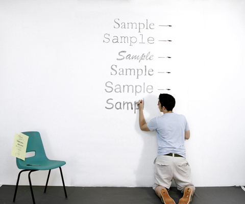
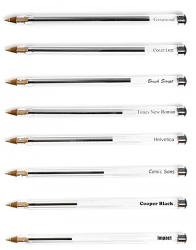
Two British designers put together an interesting project to show which fonts require the most ink to print. Their method was to write and fill in a sample word (“Sample”) on the wall with a ballpoint pen and then use the pen’s remaining ink to show each font’s mileage.

Of the eight fonts tested they found Garamond to be the most efficient, and Impact to be the most wasteful.

Ink-guzzling Impact has been our chosen font for videos since Day 1 and we’ve also rocked it for our name on bootleg business cards and website headers. Now I feel some sort of remorse having learned that we’ve been recklessly promoting the most ink-wasting-est font in the universe.
Then I remember we make stuff for the post-literate Internets, not the printer-nets.
Besides I prefer to look at the ink-cartridge as being half full. Given our preference for white text on a black background, we’re actually using the font that creates the most white space. So please, let’s think of Impact as the most responsible and least wasteful font to use – when you’re already printing a big blob of black ink.
(link via Kottke)

